2026
branding
MRF has always stood for trust and performance. This rebranding reimagines the iconic Indian brand with a contemporary identity that balances its legacy with a more inclusive, future-focused vision.


why kabir
"Kabir" is my name, my heritage, and my guiding philosophy where simplicity, unity, and truth shape every frame, design, and story.
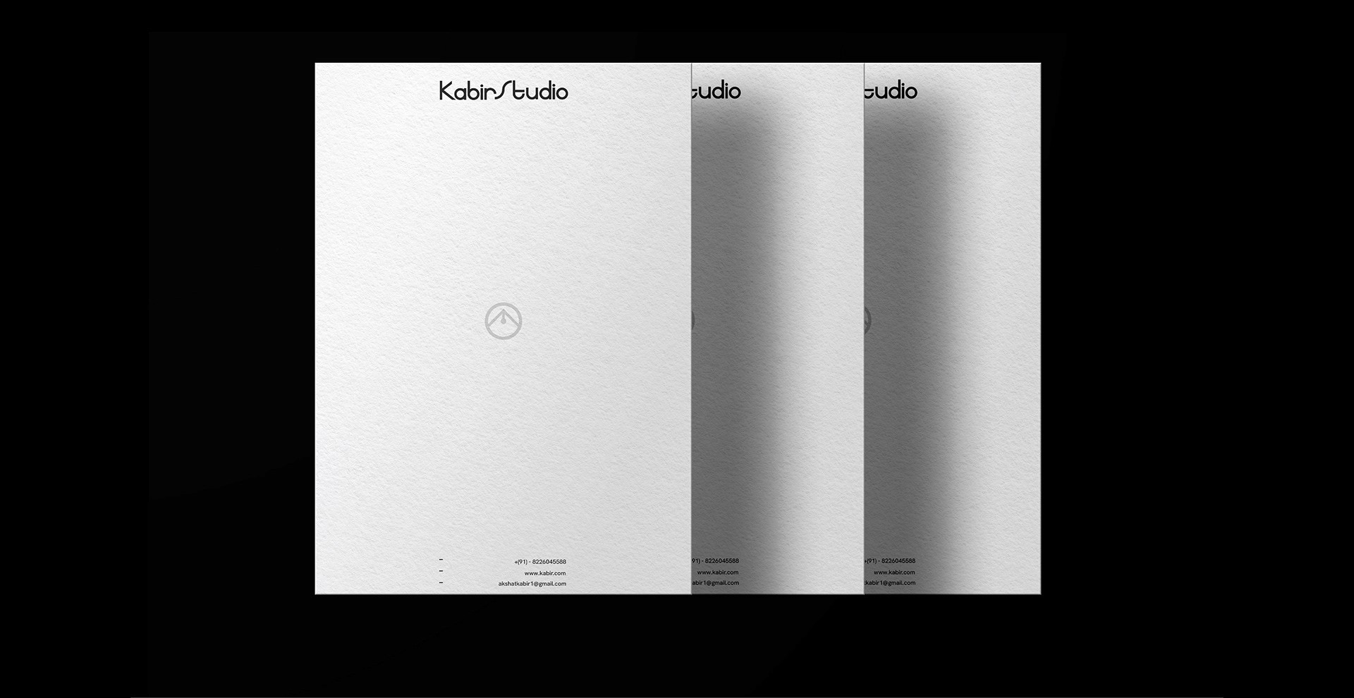
Kabir Studio is the multidisciplinary practice that turns every medium into a vessel for authentic human experiences.
scope
Brand identity • Logo design - Typography - Publication design - Graphic novel - Motion graphics • Film - Photography

Logo
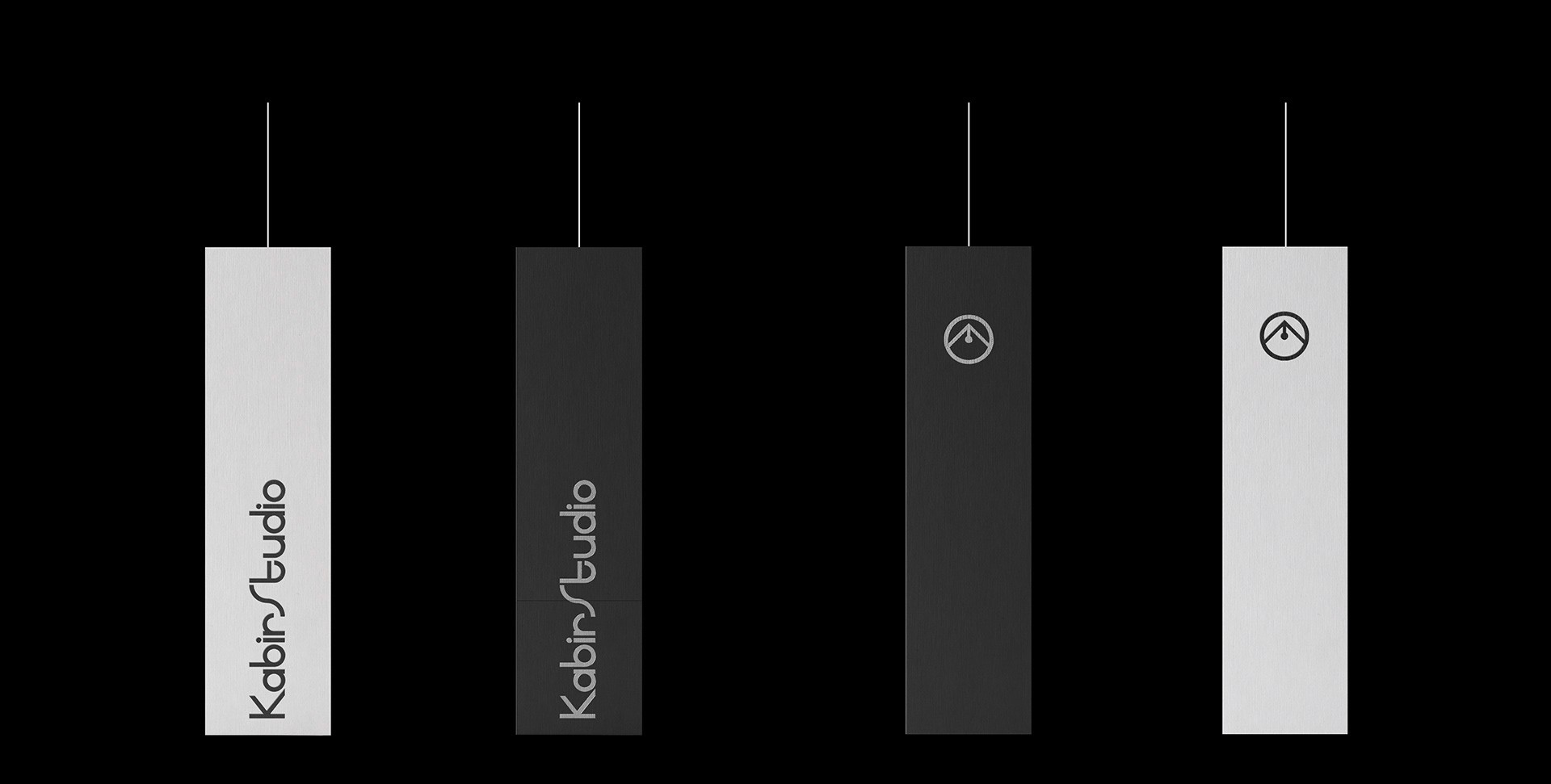
The logo is inspired by Sant Kabir's peacock feather, reduced to its essential geometric form. The triangle represents the tip of the poet's pen symbolizing creative expression and authentic voice. Two concentric circles reflect unity and completeness while honoring my hometown Shivpuri. This minimalist symbol connects personal heritage with timeless wisdom, embodying the studio's commitment to clarity, truth, and purposeful creation.


Primary Typeface
seacord
Seacord, is a custom geometric sans with consistent stroke weight and sharp, angular terminals that mirror the logo's precision. Its open circular counters and diagonal cuts evoke the pen-tip motif,reinforcing the brand's hand-crafted authenticity. Highly legible at any scale, Seacord combines modern confidence with minimalist elegance, making it the perfect voice for a studio grounded in clarity, craftsmanship, and timeless expression.
Secondary Typeface
Hanken Grotesk
Versatile and clean, it reflects innovation and clarity for body content.





more works


